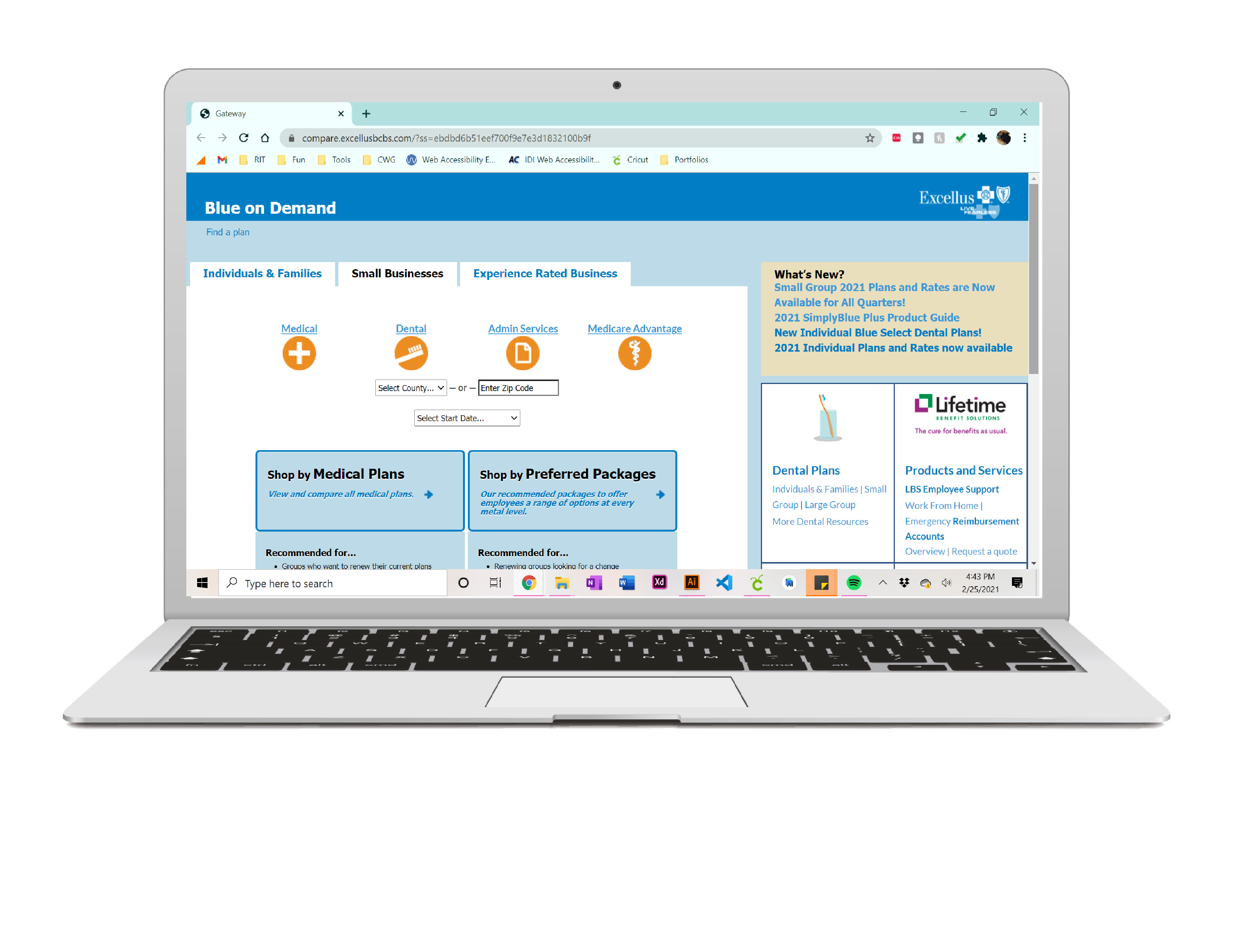
Blue Cross & Blue Shield Marketing Web App
Goals
Business Goals (BCBS)
- Add a new type of insurance plan into the existing web application
- Unify the design, but differentiate the new plans somehow
User Goals (Insurance Brokers)
- Sell insurance!
- Quickly find insurance plan for their customer
- Easily see all information about plans

Solution
- Add new color to pallet to differentiate the new plan type
- Create a drop down that includes the multiple levels
Role
User Experience Designer
- Produce prototypes to team and justify design decisions
Timeline
1 Month
Project Type
Paid freelance work
Team
- Worked mostly independently
- Met weekly with BCBS team
- Collaborated with developer when necessary
User Research
Questions
I was unable to do a competitive analysis, because products of this kind are only accessible to insurance brokers who work at the company. Due to Covid-19 I was also unable to sit down with real users to do card sorting or other activities. The best way for me to get information was asking lots of questions during my meeting with BCBS!
Examples:
- Are you open to adding to or changing the color pallet?
- What is the typical age of the insurance brokers?
- How comfortable are the brokers with the current user interface?
- How often are they using this application?
Persona – Insurance Broker
- Use this product on a daily basis
- Experienced and comfortable with current user interface
- Quickly and easily find information they need
- Do not want to be thrown off by addition of a new product
Ideation
Sketches
Coming soon!
User Flow
- Click into either small or large group
- Select method to shop by
- View Plans
- Expand dropdowns to view details or levels
- Select Plans to compare
- Generate PDF
Testing
Using Invision users were able to interact with the site as it would be after development.
Findings
- The arrow icon on the dropdown did not stand out enough
- made it into a circle with the arrow icon inside and drop shadow to make it stand out more
- Users were unsure how to close the dropdown
- changed the arrow to face upwards when it is open
Prototypes
More information coming soon!